The NBA and Nike have unveiled the NBA city edition jerseys 2021-2022.
Ranked: NBA city edition jerseys 2021-2022
The NBA city edition jerseys showcased some of the most unforgettable moments of each franchise. These uniforms basically represent the old and new school.
Here’s the ranking of the top NBA city edition uniforms this season…
20. Sixers
The aesthetic in this one looks very different from the Sixers classics and throwback uniforms. Here, they featured a multicolor pattern and the arena logo on the shorts that symbolizes the Philadelphia Spectrum Arena—their home for more than four decades.
While it veers away from their classic red, blue, and white colors, you’ve got to give them credit for trying something out of the box.
19. Nuggets
The rainbow color has been utilized in lots of Nuggets uniforms. They took it up a notch by bringing back the Tetris pattern on the side panels, shorts, and the neckline.
Meanwhile, the other details on the jersey tell the story of their iconic moments from the past.
Their new NBA city edition jersey looks fun and quirky. Just fitting for a player like Nikola Jokic.
18. Heat
The Heat mashup uniform features a collage of letters and numbers from their most iconic jerseys. Everything else is detailed that resonates with their greatest moments throughout the years.
Props to the Heat for experimenting with something new than the Vice City versions. This also looks better than last year’s gradient uniform.
17. Suns
The design is inspired by Arizona’s geographical landscape and breathtaking scenery. Its bright and pixelated colors clearly represent the hues of sunsets and sunrises. “The Valley” also stands out in the middle which represents the Phoenix metropolitan area.

Even though they retained the same design from last year, it’s still one of the best NBA city edition jerseys this season.
16. Lakers
The Lakers uniform features the main Lakers purple used since the 60s. Meanwhile, the baby blue color represent their roots from when they were still based in Minneapolis.
There’s not much to say given the minimalistic design. It’s aesthetically pleasing and fitting for the new era of “Showtime”.
15. Cavaliers
The gold and wine colors represent the Cavaliers franchise. What stands out in this jersey is the team’s iconic swashbuckling swordsman from the 70s.
Cleveland fans definitely missed that.
While they returned some throwback details in the jersey, it doesn’t look outdated. They balanced it out with a modern design.
14. Clippers
The pacific blue color’s inspiration came from the team’s former unis as the Buffalo Braves and San Diego Clippers. What stands out is the three white sails on the shorts which represent the original Clippers logo.
It’s good to see the Clippers bring back these colors. It looks so fresh and clean.
13. Blazers
The uniform pays homage to Portland’s rich history and being the “City of Roses”. It features the iconic “Rip City” font from the 90s. Meanwhile, the signature plaid pattern is a nod to its city culture and some of its franchise all-time greats.
It’s ironic that they didn’t do much with the design but it still looks great. An all-time effortless beauty.
12. Warriors
There’s a lot of details in the Warriors uniform—from some of their most most memorable moments in franchise history up to their home roots. The lightning bolts on the side pay tribute to the “We Believe” era in the 2000s.
There’s a lot of storytelling in the uniform yet they keep it minimalistic. Combining their golden colors with black will always look good.
11. Wizards
Ah, a classic one. The Wizards uniform pays homage to the classic Bullets jerseys in the 60s. Meanwhile, the other details represent some of the iconic moments in the franchise across time.
The uniform has a perfect mix of the past and the present. It’s just clean and beautiful.
10. Grizzlies
There’s a lot of detail in the Grizzlies uniform. The jersey features the stylized “Mem” Aztec-like pattern through the neck, arms, and shorts. Also, the iconic bear logo in 2002 is placed on the shorts.
Sure, it took a step back from last year’s city edition jerseys, but it’s still one of the best-looking jerseys this season and comes in at 10 among the NBA city edition jerseys 2021-22.
Buy NBA City Edition jerseys 2021-22 here
9. Knicks
The Knicks uniform features a black base with orange and blue piping. The side panels also feature a checkered design from the top down to the shorts.
This is so much better than their NBA city edition jerseys last year. Simple, yet effective.
8. Rockets
The Rockets uniform takes inspiration from their 90s jerseys and their back-to-back championships in 1994 and 1995. It also features the classic white pinstripes from top to bottom.
https://twitter.com/HoustonRockets/status/1454849201930657795
This jersey perfectly mixes their throwback uniform and the other magical moments of their franchise.
7. Bulls
The “Chicago” script is from the franchise’s debut in 1966. Above the jock tag, you can see the six championship years they won in the 90s.
There’s not much to say about the Bulls uniform when you first look at it. Yet, the minimalistic design is effective enough to tell stories from their dominant past.
6. Raptors
The black and gold color scheme is always associated with the Raptors. Here, the uniform features a jagged pinstripe while the maple leaf in the shorts symbolizes their Canadian roots. But what stands out is the famous raptor logo. Finally!
Toronto has one of the best jersey designs and logos in the league. It’s great to see them bring back some of these.
5. Wolves
They returned the original blue, green, and white color palette on this uniform. Meanwhile, the “Wolves” wordmark and forest lining are inspired by their jerseys in the early 2000s. This uniform just screams of Kevin Garnett’s MVP season.
This jersey looks perfect as it mixed different eras in their franchise history and combined it with a daring design.
4. Hornets
The Hornets are the first team that comes to mind when you see the teal color and honeycomb design. Here, they also featured their iconic purple, green, and blue pinstripes, along with the gradient background.
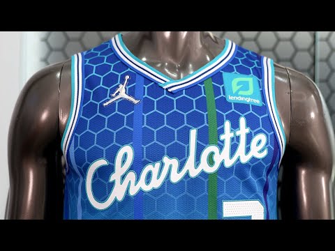
These jerseys look the best of both worlds—combining the look of their iconic uniform in the 90s and the look of the current ones.
3. Spurs
The Spurs uniforms bring back their classic fiesta colors on the lining and side panels. They also combined the silver and black logo on the front as well as their boot-spur logo on the shorts.
These uniforms are clean and mixed perfectly. I like what they’ve done here since they utilized the fiesta colors on the lining—not across the uniform like before.
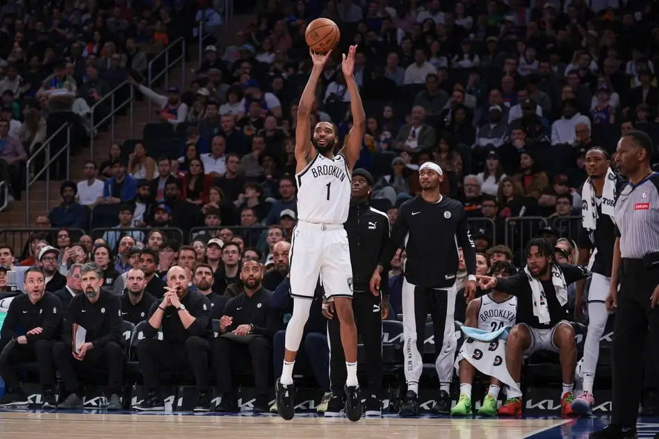
2. Nets
The Nets uniform pays homage to their franchise’s path from New York to New Jersey and back again. It also features their iconic blue, red, and white color scheme which is a nod to their throwback look in the 80s.
These uniforms are so clean. The storytelling and their classic color mix are perfectly combined.
1. Hawks
The big wingspan logo of the 90s makes a return here and it’s featured on the front.
The red and yellow colors perfectly match each other. It gives you a spot-on throwback vibe combined with the design of the new era.
This is certainly one of the best NBA city edition jerseys 2021-22.
Read more: Best NFL jerseys this season
[spreaker type=player resource=”show_id=4112709″ width=”100%” height=”200px” theme=”light” playlist=”false” playlist-continuous=”false” chapters-image=”true” episode-image-position=”right” hide-logo=”false” hide-likes=”false” hide-comments=”false” hide-sharing=”false” hide-download=”true”]